
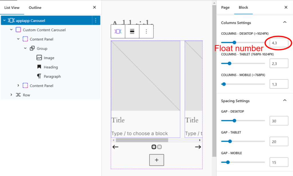
For every type of carousel, you can fully customize how it appears on different screen sizes. Both whole numbers and decimal values can be used for greater precision.
Columns Settings
- Desktop (>1024px): Set the number of visible elements for larger screens.
- Tablet (768px-1024px): Adjust the number of items shown on medium-sized screens.
- Mobile (<768px): Ensure a smooth and optimized layout for small devices.
Spacing Settings
- Gap – Desktop: Define the spacing between elements on wide screens.
- Gap – Tablet: Control the spacing for medium screen sizes.
- Gap – Mobile: Optimize the gap between elements for a seamless mobile experience.
With these settings, you have full control over how your carousel adapts across different devices, ensuring a responsive and user-friendly experience no matter where it’s viewed.